Here’s a more light-hearted look at the regular requests and comments we get from clients that fill us with dread:
6. “I’d like the links to open in a new window/tab”
This is all about usability. We understand why you’d want to open links in new windows – it keeps the visitor on your website and doesn’t send them away – but there are very good reasons why you shouldn’t do this.
Generally unless you warn a visitor to your site that a link will open a new window, they will be expecting it to open in the same window they are viewing the site in. This is the expected behaviour – the precedent that has been set down by (most) other websites on the web. If your visitors encounter something that they are not expecting, breaking the expected behaviour, it can be disorientating and frustrating.
Opening a link in a new window or tab will also reset the browsers ‘back’ button – the normal means of returning to where you were previously. The back button is considered to be the second most used button on a web browser; resetting it means the visitor loses control of their navigation.
If a web users want something to open in a new window they will generally ask for it – by right-clicking or holding ‘control’ when they click. The web has been around long enough for most web users to understand how this works – and those that don’t will simply press ‘back’ when they want to return.
The bottom line is this – if a visitor wants to leave the site, they will. As a site owner you cannot ‘force’ a user to stay on your website by only opening links into new windows. You will simply frustrate and annoy by impairing their usability.
Not convinced? Here’s a post by respected web design website Smashing Magazine
5. “Please make everything fit without any scrolling”
It is a common misconception that vertical scrolling on a site is bad. Some site owners seem to think that their users won’t understand how to scroll – and so any content ‘below the fold’ is wasted. This simply isn’t true! As a challenge we invite you to find any major website that doesn’t include scrolling on its main content pages. (e.g. Amazon product pages, BBC News homepage, your Facebook profile page.)
Scrolling encourages the user to explore the site further – it’s a natural part of the browsing experience and is much more user friendly than forcing users to click new links to see additional content.
As the web has moved on design has become more expansive, taking advantage of large format pictures and video. Tablets and mobiles have much smaller screens too, meaning that visitors with mobile devices will find themselves scrolling on most websites.
Scrolling is much more user-friendly than forcing the user to click links to view more information
Nowadays it is difficult to design a site without a scrollbar as monitor sizes and screen resolutions vary a huge amount from visitor to visitor. If you attempt to squeeze everything within the top 500 pixels or so you will simply end up making a compact and cluttered website that’s hard to read. Instead your design should utilise ‘white space’ (negative space) to allow breathing room and clarity, drawing the eye and making the browsing experience much more pleasant.
The only elements that really must appear towards the top are your logo/branding, menu and key information – everything else can be made to fit below.
Not convinced? A study into the ‘page fold’ and some interesting eye-tracking data
4. “Please use the following font: Comic Sans / Papyrus / Curlz MT …” etc
Comic sans was designed by Vincent Connare in 1994 and takes it inspiration from the typefaces used in American comics and graphic novels. It became popular in the late 90s as it was released with Microsoft’s Windows 95 operating system.
Since that time it’s become notorious for being labelled ‘the worst font’ by designers across the world. You’ll find it on posters, notices, logos (even corporate branding), letters, email – everywhere. It is partly due to this overuse that web designers dislike the font. It’s also found in the most inappropriate places – on hospital signs, police notices and the bill from a funeral director (to name but a few).
Fonts convey messages through their appearance, therefore choosing the right font to match your company/website’s brand or message is an important aspect of the web design process. As designers we sometimes spend as much time thinking about the font as we would the overall design. When you use Comic Sans, Papyrus, Curlz or any other childish or heavily stylised font, you’re conveying a message that can make you look unprofessional.
There are also readability issues: it might look great, but if it is not easy to read your visitors will end up going somewhere else
With the new advances in web fonts it is now much easier to add almost any style of font to a site – but just because we can add a font it doesn’t mean we should.
Not convinced? The ‘Ban Comic Sans’ website
3. “Make it pop”, “give it the wow factor”, “I’ll know it when I see it”
Although we would love the power to read minds, it’s unfortunately beyond the scope of the web at present. The above comments tend to surface when a customer has a high expectation of the website but little or no actual feedback to help us realise this expectation. This leaves us in a difficult position. We always want a site to have a ‘wow factor’ – every project we work on is done to the best of our ability – so asking us to ‘make it pop’ won’t give us any clearer indication of how we can achieve it.
As designers we need to know what you like and dislike. We need to understand the customer-base, the image you want to portray, the items you need to sell. Without feedback or input we’re just stuck working with the core requirements: a functioning business website displaying some (unspecified) content.
The more information you can give use about the style and type of site that you are after, the more chance there is of getting the design right first time
So if you’re tempted to say “Make it pop”, try instead to give us something clearer: “Make it brightly coloured”, or “I want big imagery to show off my products”.
Instead of “Give it the wow factor”, try “Let’s have a full-screen site”, or “I’ve had this video done professionally… let’s put it on the home page.”
When you might say “I’ll know it when I see it”, instead spend some time browsing other websites, and then say “I’ve seen what I like – what about something similar to ‘example.com’.”
Being clear and making sure you and your designer are on the same page is vital in getting the design right. We know it can be difficult deciding on a look for your new site, but if you give us reasonable and detailed feedback we can work together to produce something we are both proud of.
2. “Please add the following music track to my website…”
Music is one of the worst possible features you can add to your website. Without considering the implications some clients request music thinking that it will enhance the experience of the site – a softly played melody can give the whole site a sense of atmosphere. However if you spend any time at all considering it you’ll realise why music is not commonly found on most websites:
Many visitors will already be using their computer to play their own music. The sudden appearance of another track will have them scrambling for the ‘off’ button.
For some the music will come as a real shock – if they’ve forgotten that their speakers are on (and the volume turned up) this shock might be fairly unpleasant.
Popular music is protected by royalties – you can’t simply upload and play any track from an album you bought yesterday. You will need to pay for the rights to play it or choose royalty-free music; choose wisely – if your visitor doesn’t like the track you’ve chosen then you’re forcing them to listen as long as they’re on your website.
There are also some usability issues with music on a site: without some fairly messy code the music will break off when you click away from the page, meaning that it will restart each time you click on something new. For those with a slow connection music does eat up bandwidth, making the whole experience slightly slower and less enjoyable.
Although there was a time in the 90’s when music was considered (by some) as a great addition to your website, it is now seen as old hat and unprofessional – something very much to be avoided.
Not convinced? A longer article on why your website really doesn’t need music
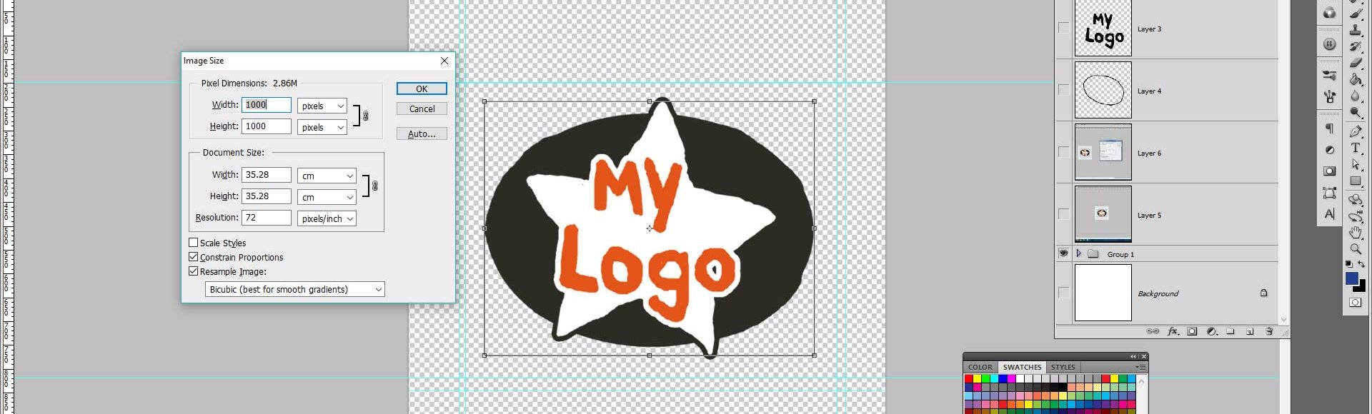
1. “Please make my logo bigger”
This really is the number one all-time classic request that has web designers rolling their eyes. During the design process we spend a great deal of time agonising over the size and position of all major elements (content, logo, menu etc) making sure to keep balance and fluidity throughout. We understand that your logo is important – but the logo and respective branding are simply there to indicate that a visitor is ‘in the right place’, nothing more.
Design surveys indicate that subtlety and white-space give an indication of quality and exclusivity, whereas brash, oversized elements feel cheap and dominating.
Consider a print advertisement with a small, subtle logo in the corner. A huge expanse of empty space around the logo brings more attention to it, even with its small size. The unused space implies luxury – there’s no need for the brand the ‘shout’ about its value.
Consider another print advert with every space inch filled with detail – text information crammed together with an enormous logo. The style is desperate – it makes the customer feel like they’re being sold to (never a nice feeling); it de-values the brand.
Subtlety gives an air of quality and exclusivity – brash, oversized logos feel cheap and dominating
The logo is never the focal point of attention on your website; this is the role of the content. It doesn’t add to the navigation (except to serve as a link to the home page), if anything it pushes other, more important content further down. A bigger logo does not give your company more credibility – if anything it suggests a certain insecurity that the business has about its image.
If you take a look around on the web you will find that the best logos are small but legible, carry an air of professionalism and are well balanced within the rest of the design. A little spacing around the logo helps to add clarity and breathing room, allowing the branding to speak for itself rather than shout.
Not convinced? See the parody site for “Make My Logo Bigger Cream”
A good web design agency will put a lot of time and effort into your web design, working with you throughout the whole process. No creative decision is made lightly – but instead with industry knowledge and an understanding of usability, accessibility and design. If your web designer tries to steer you away from a design choice there is normally a good reason why; a reason that most designers are happy to explain.