Traditionally, when building websites designers have had four choices when it comes to designing a site to fit different screen sizes: fluid, elastic, fixed or Flash.
- A fluid website, where the screen expands according to width of the browser.
- An elastic website, where the layout responds to the user’s text size preference.
- A fixed width layout that will work with the majority of browsers.
- A Flash website – a technology from Adobe that requires a plug-in.
Fluid layout
Fluid websites expand and contract depending on the width of your browser screen. With a fluid layouts we have less control over the design elements due to the fact that the main area of content expands and contracts according to screen resolution. However, it does eliminate horizontal scrollbars if designed well. With larger resolutions, a lack of content will create big areas of space that will diminish the appeal of the site. We occasionally use this method on our photographers’ websites, and display large full screen slideshows whilst keeping the aspect ratio:
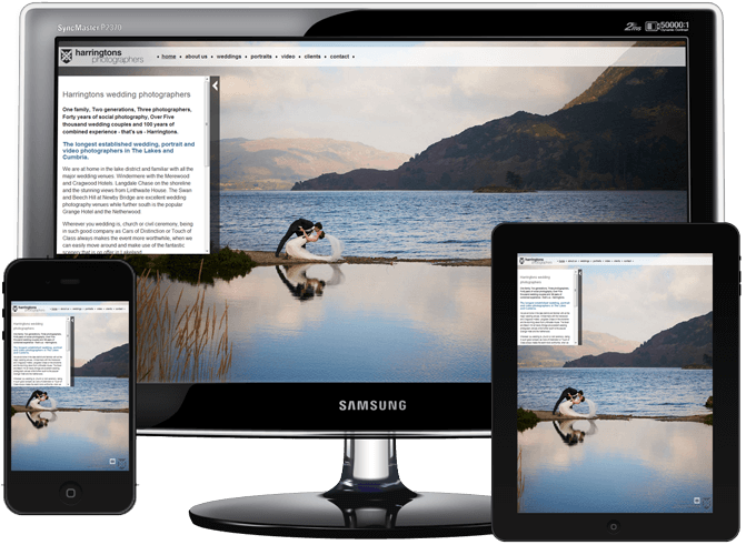
A site using ‘fluid’ layout.
Images © Harringtons Photographers www.harringtons.uk.com
Pros: Always makes the most of a visitors screen size. Big slideshow images.
Cons: Lack of control over the balance of the design. Potentially big empty spaces when viewed on large monitors.
Elastic layout
Elastic websites don’t use pixel sizes, they use the “em” unit of measurement. The em is a relative unit that responds to the user’s text-size preference. However, this type of layout can require an awful lot of testing and tweaks to work correctly in all browsers and devices.
Pros: A more adaptive layout that scales with the visitor’s screen.
Cons: Difficult to plan and test reliably.
Fixed width layout
The most popular method of design that we use is the fixed width layout. We generally work to the ‘lowest common denominator’ of screen sizes. A few years ago we had to allow for 800 pixels by 600 pixels, but the amount of people who browse the web using a screen this size nowadays is very small – according to most web statistics since 2006 this has dropped from 20% down to less than 1%.
Most fixed-width designs are now based around a width of 960 pixels. This allows the site to be viewed on a monitor which is 1024 pixels wide (with a scrollbar). This is the lowest screen size we tend to find and is still used by around 13% of internet users. The average screen size is slowly increasing – common sizes are now 1280 pixels, 1440 pixels all the way up to 1920 pixels. On a 1920 screen only 50% of the width of the monitor is used to display an average ‘fixed width’ site.
Mobile browsers (such as iPhone Safari and Android Webkit and Chrome) are capable of “shrinking” a site to fit the available display area. For example, the popular Android phone ‘Galaxy Nexus’ has a screen resolution of 720 x 1280 pixels when in portrait mode and displays websites quite happily, but the screen is tiny! You can pinch the screen to make it larger, but this is not always the best solution due to scrolling issues. Mobile browsers also won’t display areas of the page outside the main flow of the document, such as a large background. We could create different websites for different screen sizes and different devices, but this is incredibly inefficient and time consuming.

A site using ‘fixed width’ layout.
www.russells.uk.com
Pros: Absolute control over the layout of the site.
Cons: Does not make the best use of new large screen sizes.
Flash websites
Flash is a technology which allows developers to create interactivity and animated graphics in a website. It can also run full screen and scale to the size of the visitor’s browser window. However Flash has as many drawbacks as it has positives: From the developers standpoint, learning to create animations and forms in Flash can be difficult and time-consuming. They are generally very slow to load, and they are not compatible with some mobile devices such as the iPad, iPhone and the upcoming Windows 8 devices. Flash sites can be crawled (badly) by the search engines, but the results are not good and sites are notoriously difficult to get listed.
We used to use small amounts of Flash within our pages to show animations and slideshows. As this can now be done just as effectively using other technologies that will work on all browsers, we took a decision in 2010 to stop using Flash altogether.
Pros: Layout adapts to any size screen.
Cons: Does not work on Apple mobile devices, is slow to load and difficult to rank of search engines.
Responsive website design
Responsive web design is a relatively new technology that works on most modern browsers including Google Chrome, Firefox, Opera and the latest version of Internet Explorer (version 9). Responsive sites use code to request the size of the screen and adjust the layout accordingly (even as you resize the window). This can include changing the layout, text and image sizes.
The common method of employing responsive design is to create ‘break points’; a set of sizes after which the layout adjusts.
For example, you might have a site showing one column of text when viewed on a smart phone. This become two columns when viewed a larger screen, such as an iPad. On a laptop you get three columns, and on a large format wide-screen monitor you get four columns. This can be used for other elements on the page – e.g. the background image, the size of the logo, the way the menu appears and so on.
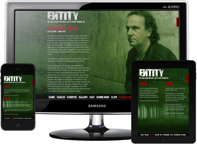
A site using responsive design
www.entitythemovie.com
We’ve used these features to great effect on the Entity website. Text elements change their font size, images reduce and enlarge in size and the menu gets bigger and smaller. Even layouts of text and images move from two column to a single column on narrow screens.
We’re currently working on a completely new website for our Phosys Web Design brand (websites for photographers). As our target market is photographers (who generally have larger screens), we’re planning to create a scaling, adaptive design that will also display correctly for small screens like mobiles and tablets.
Watch this space!