You may have noticed that The Cybermill website has a new look, over the past couple of months we’ve been hard at work here at our offices in Escrick near York, producing a new website we can be proud of. We think the new site, launched at the beginning of February, is a great improvement on the previous one, bringing us up to date with the latest standards and making use of some new techniques and technologies.
The hills, the hills!
Although we love our branding, and the use of the illustrations in the previous site, we felt it was time for a more professional look that still kept the values that our previous website encapsulated, being open, friendly and approachable.
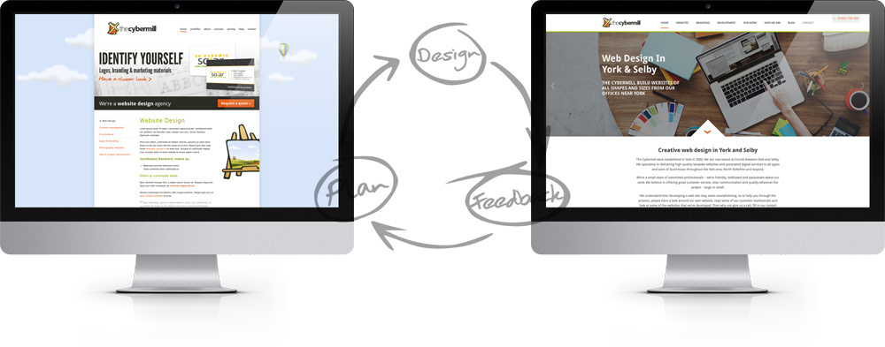
As you can see, the previous site made use of background of clouds in the sky and a larger illustration towards the footer, and whilst we loved this we decided that the site needed a more open design, that made more use of the full browser window and felt a little bit more professional. The new site makes use of much more white space, and a more open design content area, while still referencing our rural location by including a smaller hill graphic in the footer.
We’ve kept the same colour scheme of lime green, dark grey, light grey and orange for all things clickable, and we’re still using the same font to continue our brand throughout the whole design, although styling for the different headings has been adjusted to work more harmoniously within the design.
Making more of the work we do
On our previous site we included a portfolio section. So to make more of the work that we do (as we’re so proud of this), we’ve extended this section and included more in-depth case studies on some of our more recent projects.
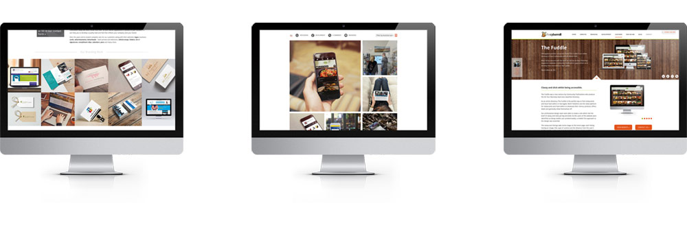
We’ve also included “image squares” at the bottom of different sections of the site. These showcase work we have done in the area which is relevant to the services that the page is describing. We’ve also been hard at work creating the images to show off our work, we’ve chosen to use photographic images throughout the site, which works well with the new cleaner design.
We also updated the sections about the work we do, giving more room to the custom programming and development that we do and also our new range of websites for small businesses called Breeze.
The nuts and bolts
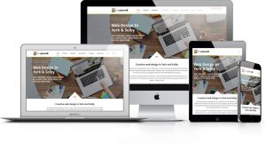 We’ve built the site in WordPress again which is our CMS of choice, mainly because of the control this gives us over the inner workings of the site.
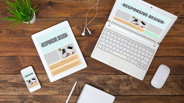
The site is responsive and so will work well on devices of many different sizes and orientations, we’ve also worked hard to improve the speed of the website making sure it is quick to load for all devices.
We’re also pleased to be able to use some of the features of the latest up-to-date code (HTML5 and CSS3/CSS4), but as ever our goal is making a website that is attractive, functional and easy to use. Hopefully you agree with us!