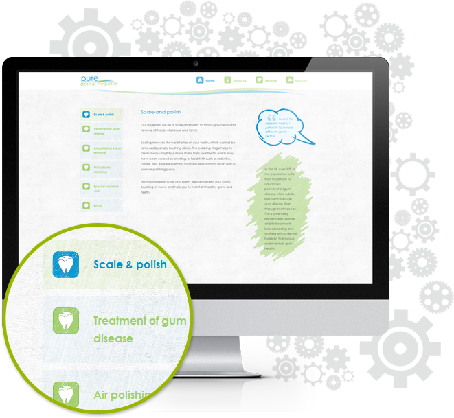


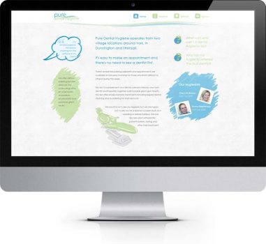

 The hand drawn style is continued throughout the site, the site almost takes on the appearance of a collage, with the different styles of graphics, appearing at different levels on the background.
 The bubbles and graphics used from the existing branding have been given a subtle drop shadow so that they appear on top of the background.
 The icons in the main navigation were also hand drawn by us to add to the feel of the site.
Managable chuncks
To organise the information on the different sections more efficiently we have used a pop-up box on the about section, this opens up the answers to the questions of this page. This information is important and legally had to be on the site, but took up a lot of room.
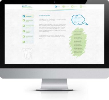
Again to split up the information into more manageable chunks in the services section we make use of interactive tabs, which reveal the relevant information on click.
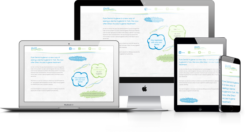
The site is also designed to scale taking advantage of larger screen resolutions, but adjusting for those on smaller screens.