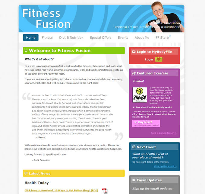
A new website for personal trainer and lifestyle coach Anna Ferguson. Anna’s business is called Fitness Fusion; services include workout regimes, one-on-one personal training and nutritional advice.
Anna’s old website had been live for about four years. The old site was not content managed and desperately needed a new fresh look.
One of the key new features Anna requested was to offer weekly downloadable PDF files containing fitness guides and health information. The site also needed to link in to her social media accounts at Facebook and Twitter, and to her online A-store (Amazon Store) shop.
Finally, the site would also serve as a hub of information on Anna’s busy daily routine, with updates on local events and exercise classes.
The design brief was wonderfully open: Anna was happy to give us (more or less) free reign on the style of the site, just as long as it portrayed her business in the right way.
The design
Fitness Fusion is all about self-improvement through proper diet and exercise – so we decided to focus on a design that was bright, open and energetic.
We preferred a predominately white background colour because it works well next to strong contrasting colours and it gives everything a lift.
A colour scheme was chosen for the rest of the site with bright, strong hues that would give a feeling of energy and vitality.

The Fitness Fusion colour scheme
For the content of the site we decided to use a ‘modular’ format, where a number of different sections are repeated on different pages. Each coloured panel on the right is interchangeable, with different pages showing different panels.
Special attention is given to certain features of the site, for example:
Featured exercise: This column enables Anna to highlight the current popular exercise class, and give information on how to book and where the next class will be.
Next event: Anna can update this module to bring attention to larger events and to send visitors on to the events page for more information.
A few design details from the Fitness Fusion website
This apple graphic is cropped from a stock photo. The rest of the bottom of the page uses a matching green hue to tie the footer together.
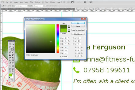
The website footer
The edges of most areas of the site are rounded using CSS3, the latest version of the code we use to style websites. Clever implementation of this code means that the site will still look great even on old, out-dated internet browsers.
Anna’s photo has been edited to remove the background so she fits seamlessly into the header of the site. Having a photo is a great idea for a personal trainer like Anna, whose clients will want to know who they’re dealing with.
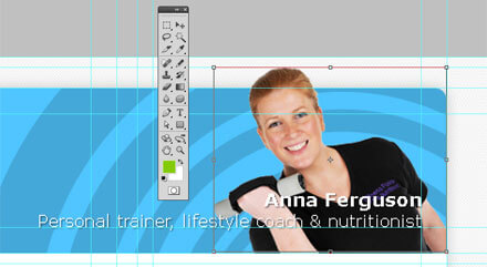
Anna’s photo finishes off the site header
The features:
A PayPal ‘buy now’ button was added to the site so Anna could take advance bookings for her Zumba classes. This button ties neatly into the rest of the site a custom-made graphic and shopping basket icon.
A ‘sign up now’ box, shown on the home page, was included so customers could sign up for Anna’s newsletter. Anna’s free downloadable PDF files can be saved here too.
We inserted a slideshow on the ‘About Me’ page to include a few photos of Anna in action; the slideshow is non-Flash so the website will work on iPhones and iPads.
The outcome:
Anna was completely delighted with her new website – helped by the fact that she made several bookings within an hour of launching!
Here’s Anna’s testimonial:
The website building and design service that The Cybermill provides is second to none. It is amazing how I can log on and have access to my own website 24/7 and can make changes quickly and easily – their software makes it very easy to run my site and my business. The Cybermill team are always happy to help, totally professional and full of great advice. I couldn’t be happier with the results!
They have added features to my website that has increased business and the website pays for itself easily. I would recommend The Cybermill to anyone.